


Numbers Time: I Made a Map!
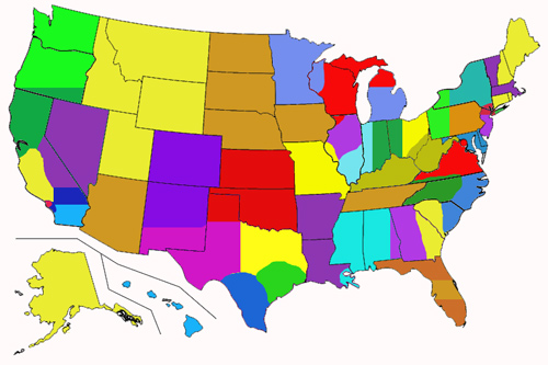
Oh, this map. It's a thing of beauty. By the way, if you ever want me to write an insanely nerdy blog post, casually mention something to me over dinner, and apparently I will run with it. This time it was a conversation about apportionment of electoral votes. We Californians have a bit of a sore spot about the electoral college. Does Wyoming really deserve three whole electoral votes when their population is less than Milwaukee? Milwaukee doesn't get three of their own electors. Los Angeles County has more people than all but nine states, but we don't get 82 Senators.
What often comes up, especially in California, is the concept of combining some of the smaller states. I realized in this dinner conversation that a lot of the country would be against it when they realized how little of the country (in terms of actual land) could end up being an entire Senate district. What would a map like that look like, with all evenly distributed districts? Thanks for asking. The answer is the above map.
Sweet Map, How'd You Make It?
Okay, it's Numbers Time! The population of the United States is roughly 321 million. Divide that by 50 and it's 6.42 million. Simple.
The complicated part is remembering these are not just numbers. People have a very personal connection to their state. Georgia, for example, has 10.3 million people, meaning it can't just be split into two districts of 6.42. To do this fairly, some of Georgia would have to combine with parts of a surrounding state. Which state? Which parts wouldn't be mortified to split from their home state to side with outsiders? On the other hand, does someone from southern Illinois have more in common with someone from southern Indiana than they do someone from Chicago?
My two biggest goals were maintaining as many whole states as possible and avoiding gerrymandering. Michigan and Ohio both went Red in 2016, but if you wrap a district around Cleveland and Detroit, they go easily Blue. I wanted to, as much as possible keep the balance in districts that exists in states. Sometimes this means carving out two whole Blue districts in Texas, but it also means the majority of New York State is Red.
Once I started combining states, slightly higher numbers became much more natural. Combining red states Alaska, Idaho, Montana, Wyoming, and Utah came out to about 7.1 million people. The Dakotas, Iowa, and Nebraska combined to 6.7 million. Maine, New Hampshire, Rhode Island, and Connecticut are 7.3 million.
The hardest areas were the Midwest and Deep South. The populations of these states were just not dividing evenly, so I had to split a lot of them up. Originally, I had several more whole states than in this model, resulting in districts as small as 6.6 million and as large as 7.7. The larger the population, the less representation per voter, so ultimately I chose equality over state borders.
All in all, I ended up with 45 districts, ranging from 6.7 million to 7.4 million. Amazingly, 34 of 45 districts fall between 6.9 and 7.2 million.
How Would This Amazing Map Work?
Sorry, just wanted to show off my sweet map again.
As Nate Silver fans know, there are 538 electors. The Constitution says that's based on the total number of Senators and Representatives, so let's re-define states as these districts. Divide 538 by 45, you get 11, remainder 43. So 43 districts get 12 electors, two get 11. Northern Central District (the Dakotas, Iowa, Nebraska) and Tennessee District have 6.7 million people, so they get one less elector. This means:
• one elector in L.A. County District (7.4 million, 12 electors) represents 617,000 people
• one elector in Arizona District (7.2 million, 12 electors) represents 600,000 people
• one elector in Long Island District (6.9 million, 12 electors) represents 575,000 people
• one elector in Tennessee District (6.7 million, 11 electors) represents 609,000 people
In our current system, Wyoming's 3 electors give them one electoral vote per 195,000 people; whereas, in California, our 55 electors give us only one electoral vote per 712,000 people. That's a 517,000 person disparity. With this map, the largest disparity is 42,000.
I took each of the 45 districts and used 2016 county-by-county election results to try to guess who would have won each new district. The results were fundamentally even, 23 for Hillary, 22 for the winner. In some cases, I could slide district lines slightly and flip that. Southern Michigan and Southeastern Texas go Blue, but Central New York and Nevada-California go Red.
With an even distribution of city vs. rural, democratic vs. republican, both within districts and balancing districts against each other, we have a map that truly reflects the electorate we're supposed to be college-ing.
Here's that map again, you know, to help reference the chart, not because I want to show it off again.
New Electoral Districts
| |||
| Name | Description | Pop. | |
| Outer New England | ME, NH, RI, CT | 7.3 | |
| Massachusetts-Vermont | MA, VT | 7.4 | |
| Long Island | Long Island from eastern tip into some of Brooklyn | 6.9 | |
| Greater New York City | Western Brooklyn, Manhattan, Bronx, Staten Island South Westchester County., Northern New Jersey | 6.9 | |
| Central New York | NY State, excluding NYC, Long Island, Greater Buffalo | 6.9 | |
| Pennsylvania-New York | Western PA, Greater Buffalo Area | 6.9 | |
| Eastern Pennsylvania | Eastern PA | 6.9 | |
| Southern New Jersey | NJ without greater NYC area | 6.9 | |
| Maryland-Delaware | MD, DE | 7.0 | |
| Central Midwest | WV, KY, Southeastern OH | 7.2 | |
| Northern Ohio | Northern OH, including Cleveland, Toledo, Columbus | 7.2 | |
| Ohio-Indiana | OH: Greater Cincinnati, Eastern IN | 7.2 | |
| Indiana-Illinois | Western IN, Southeast IL | 7.0 | |
| Southern Michigan | MI: Most of Lower Peninsula | 7.2 | |
| Northern Midwest | MI Northern Lower Peninsula, all Upper Peninsula, Most of Eastern WI, IL: Greater Rockford | 7.2 | |
| Minnesota-Wisconsin | MN, Northwest WI | 7.2 | |
| Central Illinois | Most of IL, including Chicago | 7.0 | |
| Missouri-Illinois | MO, IL: Greater East St. Louis | 7.2 | |
| Tennessee | Tennessee | 6.7 | |
| Virginia-D.C. | Most of VA, DC | 6.9 | |
| North Carolina-Virginia | Southwest VA, Western NC | 6.9 | |
| Eastern Carolinas | Eastern NC, Eastern SC | 7.2 | |
| Georgia-South Carolina | Eastern GA, Western SC | 7.0 | |
| Southern Florida | Southern FL, including Miami | 6.9 | |
| Central Florida | Central FL, including Orlando | 6.9 | |
| Northern Florida | Northern FL, including Jacksonville | 6.9 | |
| Georgia-Alabama | Western GA, Eastern AL | 7.0 | |
| Dixie West | LA: Greater New Orleans, MS, Western AL | 7.2 | |
| Arkansas-Louisiana | AK, LA: all, except Greater New Orleans | 7.2 | |
| Southern Central | KS, OK, TX Panhandle | 7.1 | |
| Northeastern Texas | Dallas, much of Northeastern TX | 7.1 | |
| Southeastern Texas | Greater Austin and Houston, and between | 7.1 | |
| South Texas | Southern tip of TX up to San Antonio | 7.1 | |
| Texas-New Mexico | West TX, Southern NM | 7.1 | |
| Colorado-New Mexico | CO, Northern NM | 7.1 | |
| Northern Central | ND, SD, NE, ID | 6.7 | |
| Northwest | AK, ID, MT, WY, UT | 7.1 | |
| Arizona | Arizona | 6.9 | |
| California-Hawaii | HI, CA: San Diego County, Riverside County, Imperial County, parts of San Bernardino County | 7.4 | |
| Los Angeles County | Most of Los Angeles County | 7.4 | |
| Orange-Inland | Southeast Los Angeles County, Orange County, most of San Berardino County | 7.4 | |
| California Central Coast | Northwest L.A. County, coastal counties up to Monterey County and about halfway inland | 7.4 | |
| Nevada-California | NV, CA: Central Inland including greater Fresno County | 7.4 | |
| California-Oregon | Greater San Jose, greater San Francisco, greater Sacramento, Northern CA, Southern rural OR | 7.4 | |
| Washington-Oregon | WA, most of Northern OR | 7.4 | |
And, like, you may need to see the map again.
NOTES:
• Population is in approximate millions.
• I use the term "greater" to cast a wide net around a city or county. I tried not to be city-centric in the measurements, but they make for good landmarks of general area.
• My apologies to the people of Wisconsin. I tried really, really hard to keep you in one piece.
• Also, apologies to the remaining 1 million or so people in states whose populations fall around 4 or 8 million. This includes Oregon, New Mexico, New Jersey, Virginia, and Alabama.
• Deepest apologies to the entire Midwest and Southeast, again. Really sorry.
• However, 34 of 50 states, plus the District of Columbia are not split up in any way. Florida is split up, but none of its three districts cross state lines.
Labels: NumbersTime, Politics
posted by Daroff at
2:30 PM
![]()
 This blog is not to be taken seriously. Seriously. I take this seriously, but you shouldn't. You should do what you want, but you'll probably enjoy this more if you don't take anything I say seriously. I mean, I mean what I say, but it's not serious. Oh also, swearing is hilarious. It shouldn't be, but it is.


2 Comments:
This is an incredible concept to split the country into even districts, and you took a lot of time to do it correctly. Good job, I very much appreciated reading this.
Who dis?
Post a Comment
Subscribe to Post Comments [Atom]
<< Home